
 michi
michi 
以前載ってたサイトが無くなってしまったので、簡単に残しときます。
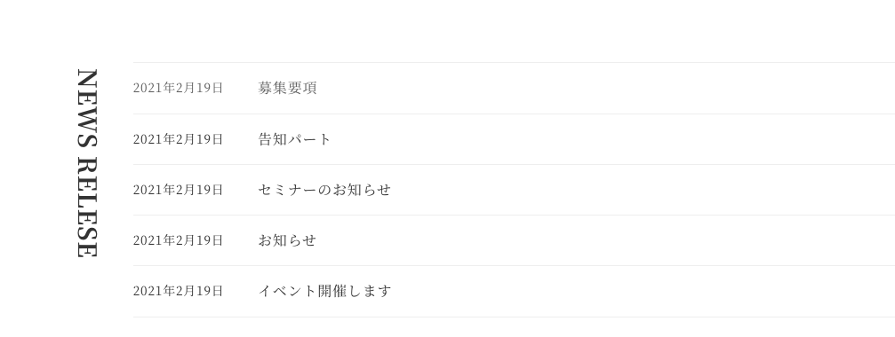
画像のNEWS RELESAの部分
セクションの中にカラムを2つ作る
左のカラムは幅を5%にし、右は95%
左のカラムの中に見出し、右のカラムには最近の投稿を入れる
左のカラムは幅を5%にし、右は95%
左のカラムの中に見出し、右のカラムには最近の投稿を入れる
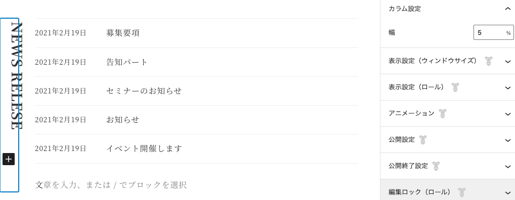
2つのカラムの親カラムと、左のカラムとその中の見出しにクラス名をつける
例:
親カラム
news

左のカラム
section-title-wrap

カラムの中の見出し
section-title
追加CSSを書く
コード
.news .section-title-wrap .section-title {
	-webkit-writing-mode: vertical-rl;//縦書きにする
	-ms-writing-mode: tb-rl;
	writing-mode: vertical-rl;
	background-color: initial;
	border: none;
	font-size: 28px;
}
.news .news-wrap {
	margin: 0 0 0 auto;
}
タブレットも横に並べる
@media screen and (max-width:999px){
	.news .section-title-wrap{
		-ms-flex-preferred-size: 5% !important;
		flex-basis: 5% !important;
	}
	.news-wrap{
		flex-basis: 95% !important;
		-ms-flex-preferred-size: 95% !important;
		flex-grow: initial;
		-webkit-box-flex: initial;
		-ms-flex-positive: initial;
	}
}
スマホは横書きに戻した
	.news .section-title-wrap{
             margin-bottom:0;
             margin-left:10px;
		transform: translate(-10px, 0);//これで横に動かしてたけどmarginでもよいのでは?
		-webkit-transform: translate(-10px, 0);//
              -webkit-writing-mode: horizontal-tb;//横書きにする
	       -ms-writing-mode: horizontal-tb;
	       writing-mode: horizontal-tb;
	}
	.news .section-title-wrap .section-title{
		font-size: 22px;
	}